11 Multivariate Analysis
11.1 Principal Component Analysis
PCA reduces a high-dimensional dataset to a smaller set of uncorrelated principal components that capture the maximum variance in the data.
Code
# Scale variables before PCA (important when variables have different units)
pca_result <- prcomp(USArrests, scale. = TRUE, center = TRUE)

# Variance explained
summary(pca_result)
#> Importance of components:
#>                           PC1    PC2     PC3     PC4
#> Standard deviation     1.5749 0.9949 0.59713 0.41645
#> Proportion of Variance 0.6201 0.2474 0.08914 0.04336
#> Cumulative Proportion  0.6201 0.8675 0.95664 1.00000
Code
fviz_eig(pca_result,
         addlabels = TRUE,
         barfill    = "#3498db",
         barcolor   = "white",
         linecolor  = "#e74c3c",
         ggtheme    = theme_minimal(base_size = 12)) +
  labs(title = "Scree Plot: Variance Explained by Each PC")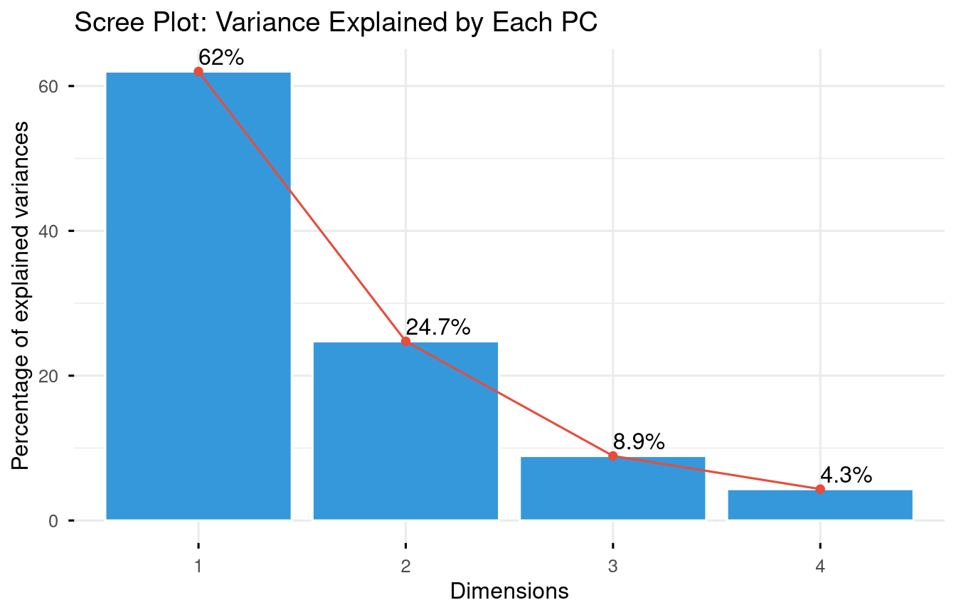
Code
fviz_pca_biplot(
  pca_result,
  repel      = TRUE,
  col.var    = "#e74c3c",
  col.ind    = "#2c3e50",
  label      = "all",
  ggtheme    = theme_minimal(base_size = 11)
) +
  labs(title = "PCA Biplot: US States by Crime Profile")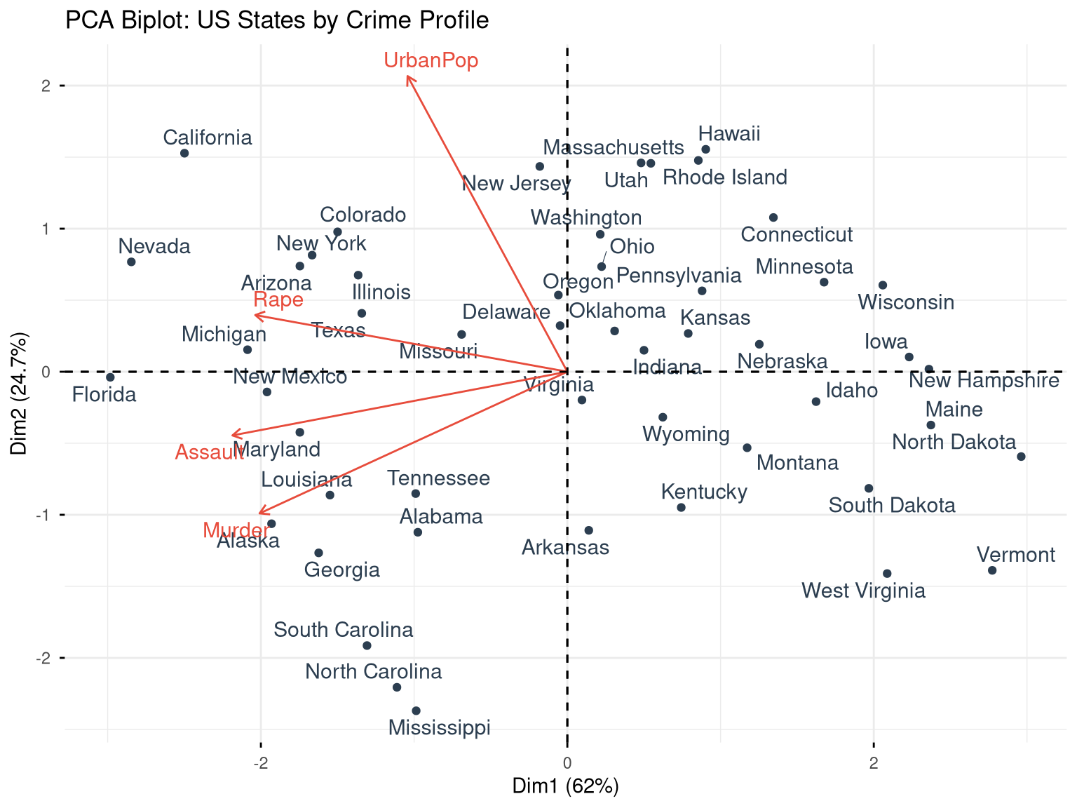
11.1.1 Interpreting PCA
Code
# Variable loadings (how much each variable contributes to each PC)
pca_result$rotation
#>                 PC1        PC2        PC3         PC4
#> Murder   -0.5358995 -0.4181809  0.3412327  0.64922780
#> Assault  -0.5831836 -0.1879856  0.2681484 -0.74340748
#> UrbanPop -0.2781909  0.8728062  0.3780158  0.13387773
#> Rape     -0.5434321  0.1673186 -0.8177779  0.08902432

# State scores on each component
head(pca_result$x)
#>                   PC1        PC2         PC3          PC4
#> Alabama    -0.9756604 -1.1220012  0.43980366  0.154696581
#> Alaska     -1.9305379 -1.0624269 -2.01950027 -0.434175454
#> Arizona    -1.7454429  0.7384595 -0.05423025 -0.826264240
#> Arkansas    0.1399989 -1.1085423 -0.11342217 -0.180973554
#> California -2.4986128  1.5274267 -0.59254100 -0.338559240
#> Colorado   -1.4993407  0.9776297 -1.08400162  0.001450164

# Proportion of variance
prop_var <- (pca_result$sdev^2) / sum(pca_result$sdev^2)
cumsum(prop_var)
#> [1] 0.6200604 0.8675017 0.9566425 1.0000000
11.2 K-Means Clustering
K-means partitions observations into K groups by minimising within-cluster sum of squares.
Code
# Scale the data first
arrests_scaled <- scale(USArrests)
11.2.1 Choosing K
Code
fviz_nbclust(arrests_scaled, kmeans, method = "wss") +
  geom_vline(xintercept = 4, linetype = "dashed", colour = "#e74c3c") +
  labs(title = "Elbow Method for Optimal K",
       x = "Number of Clusters", y = "Total Within SS") +
  theme_minimal(base_size = 12)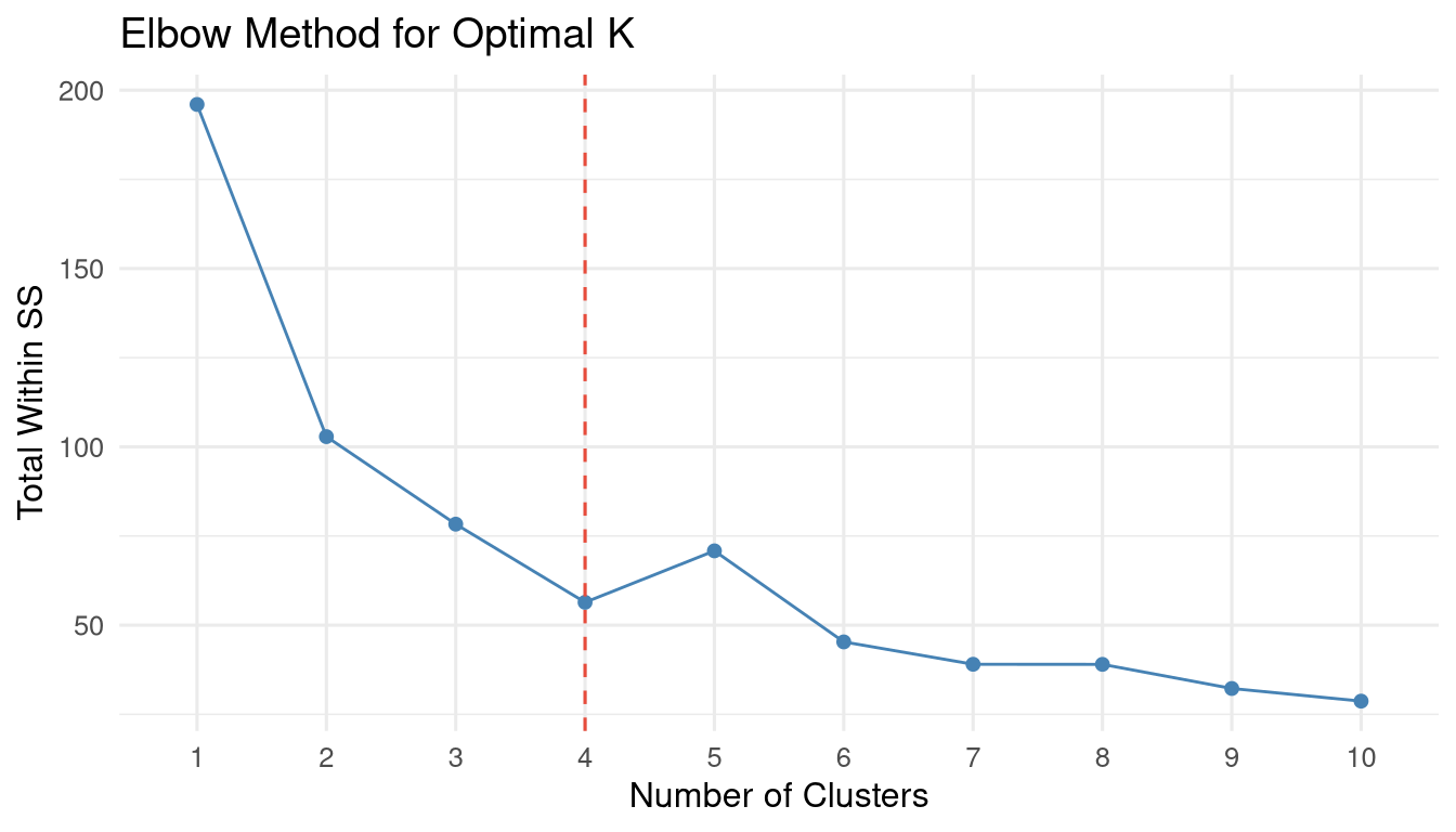
Code
fviz_nbclust(arrests_scaled, kmeans, method = "silhouette") +
  labs(title = "Silhouette Method") +
  theme_minimal(base_size = 12)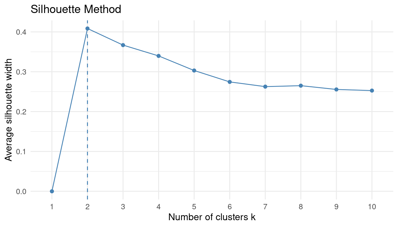
Code
set.seed(42)
km_result <- kmeans(arrests_scaled, centers = 4, nstart = 25)

# Cluster sizes
table(km_result$cluster)
#>
#>  1  2  3  4
#> 13 16  8 13

# Cluster centres (in original scale)
km_result$centers
#>       Murder    Assault   UrbanPop        Rape
#> 1 -0.9615407 -1.1066010 -0.9301069 -0.96676331
#> 2 -0.4894375 -0.3826001  0.5758298 -0.26165379
#> 3  1.4118898  0.8743346 -0.8145211  0.01927104
#> 4  0.6950701  1.0394414  0.7226370  1.27693964
Code
fviz_cluster(
  km_result,
  data        = arrests_scaled,
  palette     = "Set2",
  ellipse.type = "convex",
  repel       = TRUE,
  ggtheme     = theme_minimal(base_size = 11)
) +
  labs(title = "K-Means Clusters (K=4): US States by Crime Profile")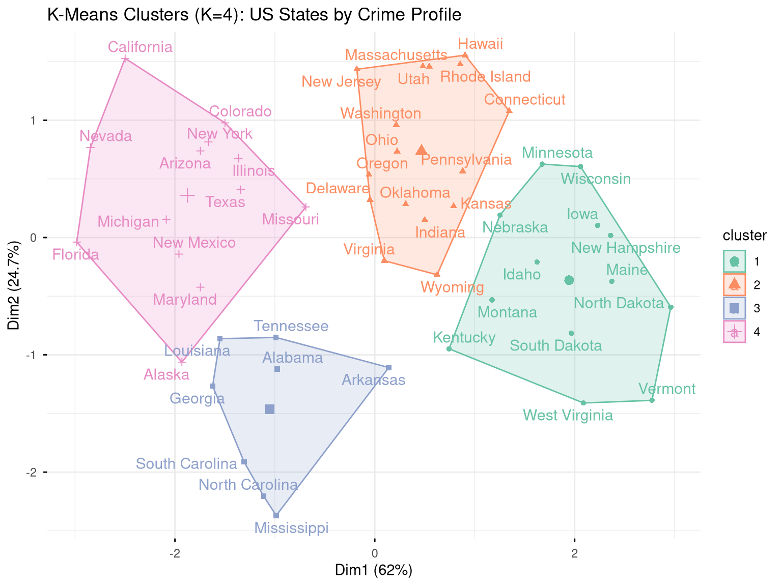
11.3 Hierarchical Clustering
Hierarchical clustering builds a dendrogram — a tree that shows how observations merge into clusters at different distances.
Code
fviz_dend(
  hclust_result,
  k           = 4,
  k_colors    = RColorBrewer::brewer.pal(4, "Set2"),
  rect        = TRUE,
  label_cols  = "black",
  cex         = 0.7,
  ggtheme     = theme_minimal(base_size = 10)
) +
  labs(title = "Hierarchical Clustering Dendrogram (Complete Linkage)")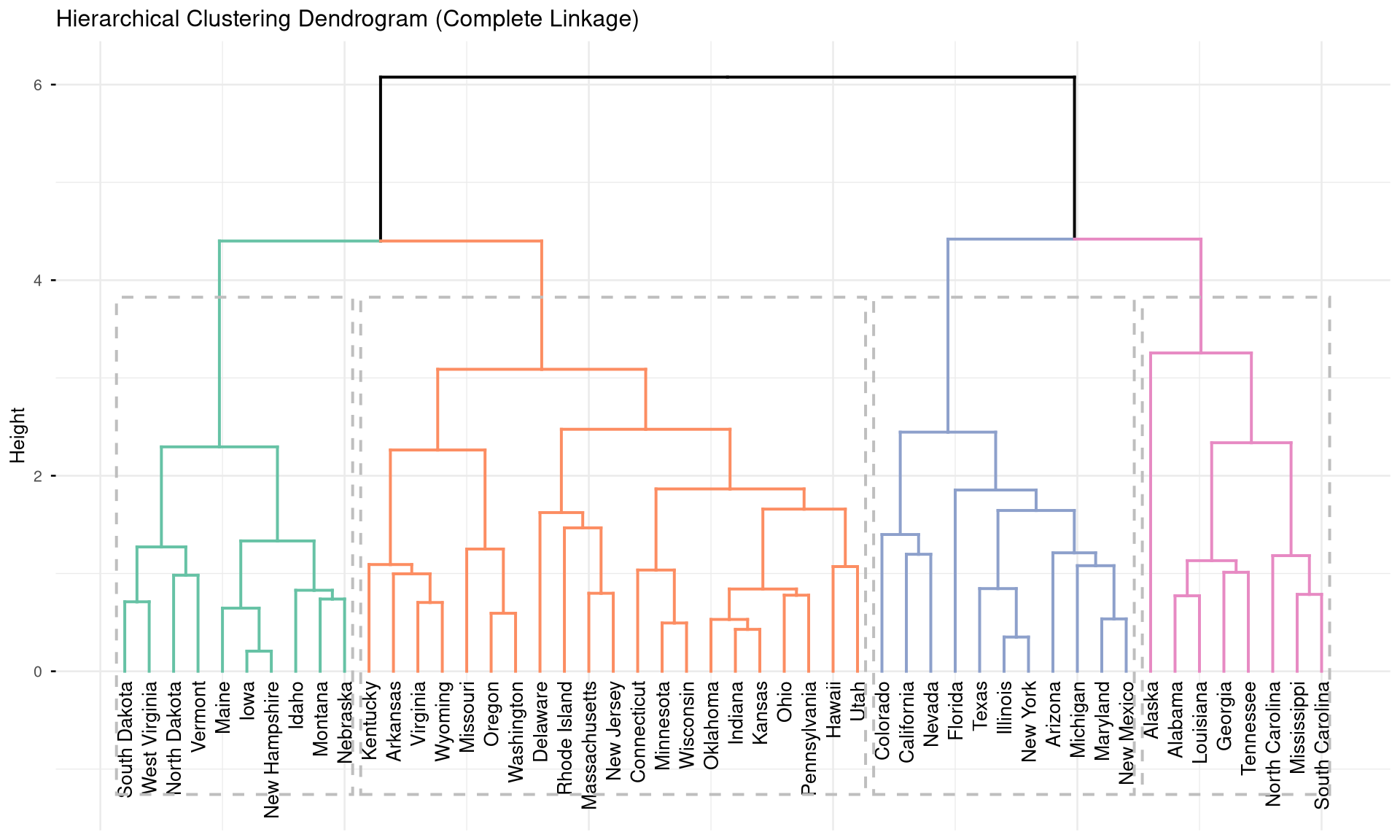
Code
# Cut the tree to get 4 clusters
hclust_groups <- cutree(hclust_result, k = 4)
table(hclust_groups)
#> hclust_groups
#>  1  2  3  4
#>  8 11 21 10

# Compare K-means vs. hierarchical
table("K-means" = km_result$cluster, "H-clust" = hclust_groups)
#>        H-clust
#> K-means  1  2  3  4
#>       1  0  0  3 10
#>       2  0  0 16  0
#>       3  7  0  1  0
#>       4  1 11  1  0
11.4 Exercises
Apply PCA to the
mtcarsdataset. How many components are needed to explain 80% of variance? Create a biplot and describe which cars cluster together.Use K-means clustering (choose K using the elbow method) to group countries in the
gapminder2007 dataset usinggdpPercapandlifeExp. Map the clusters using a scatter plot coloured by cluster.Compare K-means and hierarchical clustering on the
irisdataset. How well do the clusters recover the true species labels? Compute accuracy.Challenge: Apply PCA to India’s district-level agricultural data (multiple crop yields as variables). Create a map (using
sfpackage) coloured by cluster membership to show agricultural zones.