# Descriptive Statistics and Exploratory Data Analysis {#sec-eda}
```{r}
#| label: setup-ch6
#| include: false
library(tidyverse)
library(skimr)
library(corrplot)
set.seed(42)
```
::: {.callout-note}
## Learning Objectives
By the end of this chapter, you will be able to:
- Compute and interpret measures of central tendency and dispersion
- Use `skimr::skim()` for comprehensive dataset summaries
- Build and visualise correlation matrices
- Conduct a structured Exploratory Data Analysis (EDA)
- Identify outliers and data quality issues graphically and numerically
:::
## Why Exploratory Data Analysis? {#sec-why-eda}
Before fitting any model, you must *understand* your data. EDA is the practice of summarising and visualising data to uncover patterns, spot anomalies, test hypotheses, and check assumptions. Skipping EDA is one of the most common mistakes in data analysis.
A good EDA answers:
- What are the distributions of my variables?
- Are there outliers or implausible values?
- How are variables related to each other?
- Is there missing data? Where and why?
## Summary Statistics {#sec-summary-stats}
### Base R: `summary()` {#sec-base-summary}
```{r}
#| label: summary-demo
data(airquality)
summary(airquality)
```
`summary()` gives a quick snapshot, but it is hard to read for wide datasets and provides no information about skewness or missingness patterns.
### The `skimr` Package {#sec-skimr}
`skimr::skim()` provides a far more informative summary:
```{r}
#| label: skim-demo
library(skimr)

skim(airquality)
```
`skim()` automatically separates numeric and categorical variables, reports missing counts, and includes mini histograms for quick distributional assessment.
### Measures of Central Tendency {#sec-central}
```{r}
#| label: central-tendency
ozone <- airquality$Ozone
# Mean — sensitive to outliers
mean(ozone, na.rm = TRUE)
# Median — robust to outliers
median(ozone, na.rm = TRUE)
# Mode — no built-in function in R
mode_val <- function(x, na.rm = TRUE) {
if (na.rm) x <- x[!is.na(x)]
ux <- unique(x)
ux[which.max(tabulate(match(x, ux)))]
}
mode_val(ozone)
# Trimmed mean (remove top/bottom 10%)
mean(ozone, trim = 0.1, na.rm = TRUE)
```
### Measures of Dispersion {#sec-dispersion}
```{r}
#| label: dispersion
# Variance and standard deviation
var(ozone, na.rm = TRUE)
sd(ozone, na.rm = TRUE)
# Range
range(ozone, na.rm = TRUE)
diff(range(ozone, na.rm = TRUE)) # Width of range
# Interquartile Range
IQR(ozone, na.rm = TRUE)
quantile(ozone, probs = c(0.25, 0.5, 0.75), na.rm = TRUE)
# Coefficient of Variation (relative dispersion)
cv <- sd(ozone, na.rm = TRUE) / mean(ozone, na.rm = TRUE) * 100
cat("CV:", round(cv, 1), "%\n")
```
### Skewness and Kurtosis {#sec-skew-kurt}
```{r}
#| label: skew-kurtosis
library(moments)
skewness(ozone, na.rm = TRUE) # > 0 = right skew
kurtosis(ozone, na.rm = TRUE) # > 3 = heavy tails (excess kurtosis = kurtosis - 3)
```
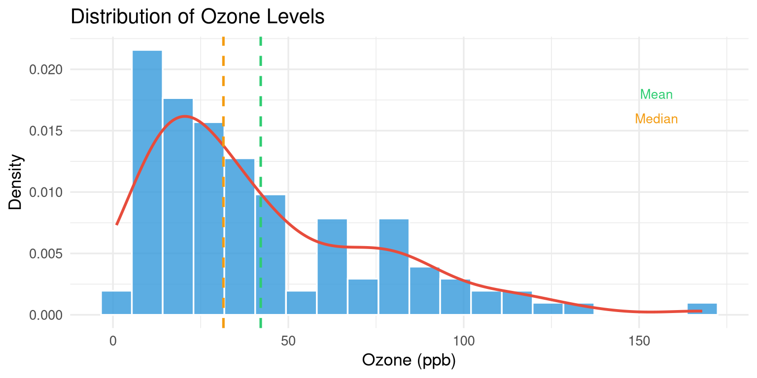
```{r}
#| label: fig-skew-demo
#| fig-cap: "Ozone levels show strong positive (right) skew."
#| fig-width: 8
#| fig-height: 4
airquality |>
  drop_na(Ozone) |>
  ggplot(aes(x = Ozone)) +
  geom_histogram(aes(y = after_stat(density)),
                 bins = 20, fill = "#3498db", colour = "white", alpha = 0.8) +
  geom_density(colour = "#e74c3c", linewidth = 1) +
  geom_vline(xintercept = mean(ozone, na.rm = TRUE),
             colour = "#2ecc71", linetype = "dashed", linewidth = 0.9) +
  geom_vline(xintercept = median(ozone, na.rm = TRUE),
             colour = "#f39c12", linetype = "dashed", linewidth = 0.9) +
  annotate("text", x = 155, y = 0.018, label = "Mean", colour = "#2ecc71", size = 3.5) +
  annotate("text", x = 155, y = 0.016, label = "Median", colour = "#f39c12", size = 3.5) +
  labs(title = "Distribution of Ozone Levels",
       x = "Ozone (ppb)", y = "Density") +
  theme_minimal(base_size = 13)
```
## Group-wise Summaries {#sec-group-summary}
```{r}
#| label: group-summary
# Add a month label
aq_labeled <- airquality |>
mutate(
Month_name = month.abb[Month],
Season = case_when(
Month %in% c(5, 6) ~ "Late Spring",
Month %in% c(7, 8) ~ "Summer",
Month == 9 ~ "Early Autumn"
)
)
# Group-wise summary
aq_labeled |>
group_by(Month_name) |>
summarise(
n = n(),
n_missing = sum(is.na(Ozone)),
mean_ozone = round(mean(Ozone, na.rm = TRUE), 1),
sd_ozone = round(sd(Ozone, na.rm = TRUE), 1),
median_ozone = median(Ozone, na.rm = TRUE),
max_ozone = max(Ozone, na.rm = TRUE)
)
```
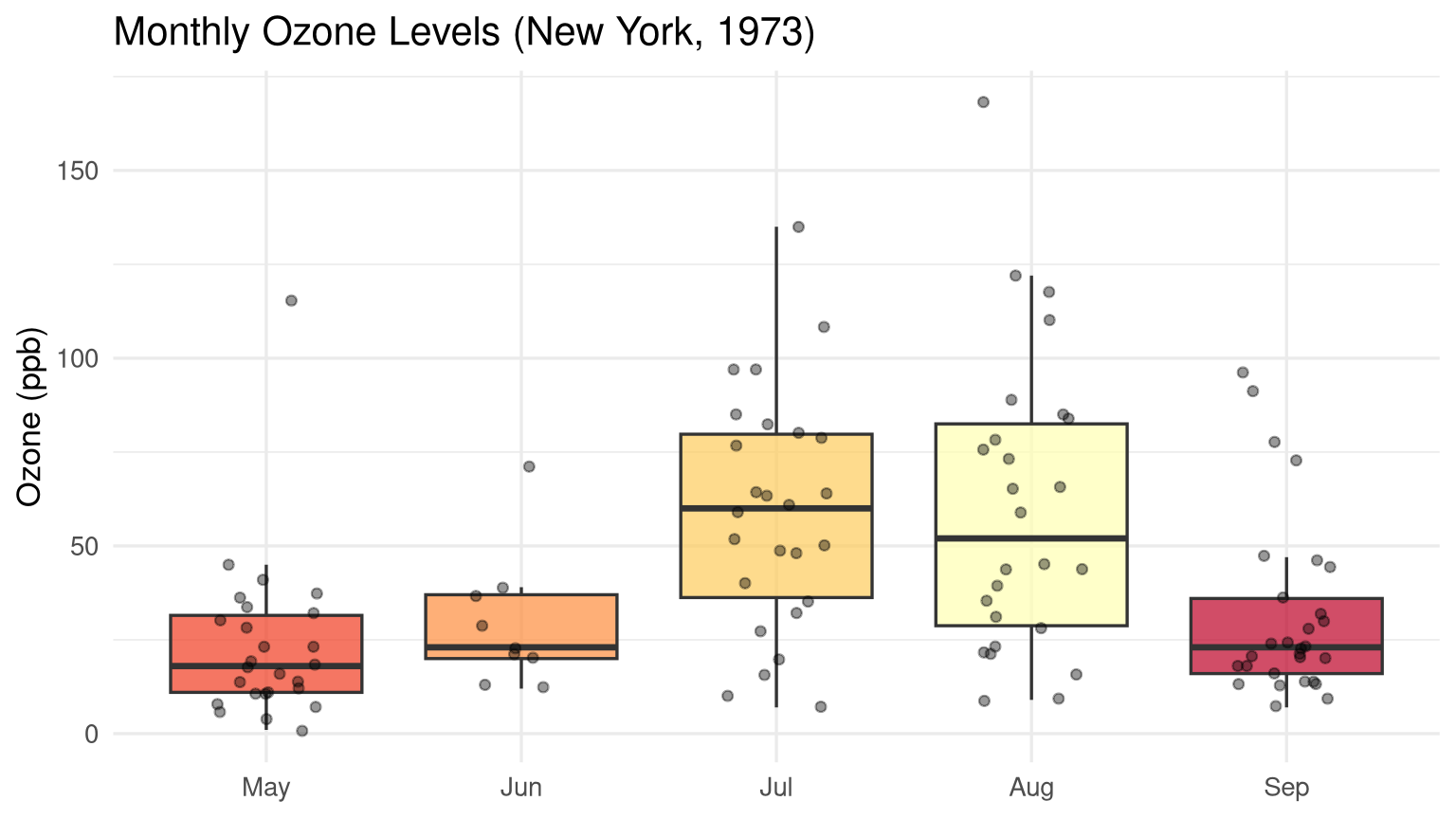
```{r}
#| label: fig-monthly-ozone
#| fig-cap: "Monthly variation in ozone levels with individual observations overlaid."
#| fig-width: 8
#| fig-height: 4.5
aq_labeled |>
  drop_na(Ozone) |>
  ggplot(aes(x = reorder(Month_name, Month), y = Ozone, fill = Month_name)) +
  geom_boxplot(alpha = 0.7, outlier.shape = NA, show.legend = FALSE) +
  geom_jitter(width = 0.2, alpha = 0.4, size = 1.5, show.legend = FALSE) +
  scale_fill_brewer(palette = "YlOrRd") +
  labs(title = "Monthly Ozone Levels (New York, 1973)",
       x = NULL, y = "Ozone (ppb)") +
  theme_minimal(base_size = 13)
```
## Correlation Analysis {#sec-correlation}
### Computing Correlation Matrices {#sec-cor-matrix}
```{r}
#| label: cor-matrix
# Select numeric columns and drop NAs
aq_numeric <- airquality |>
select(Ozone, Solar.R, Wind, Temp) |>
drop_na()
# Pearson correlation (default)
cor_matrix <- cor(aq_numeric)
round(cor_matrix, 3)
# Spearman rank correlation (robust to outliers and non-normality)
cor(aq_numeric, method = "spearman") |> round(3)
```
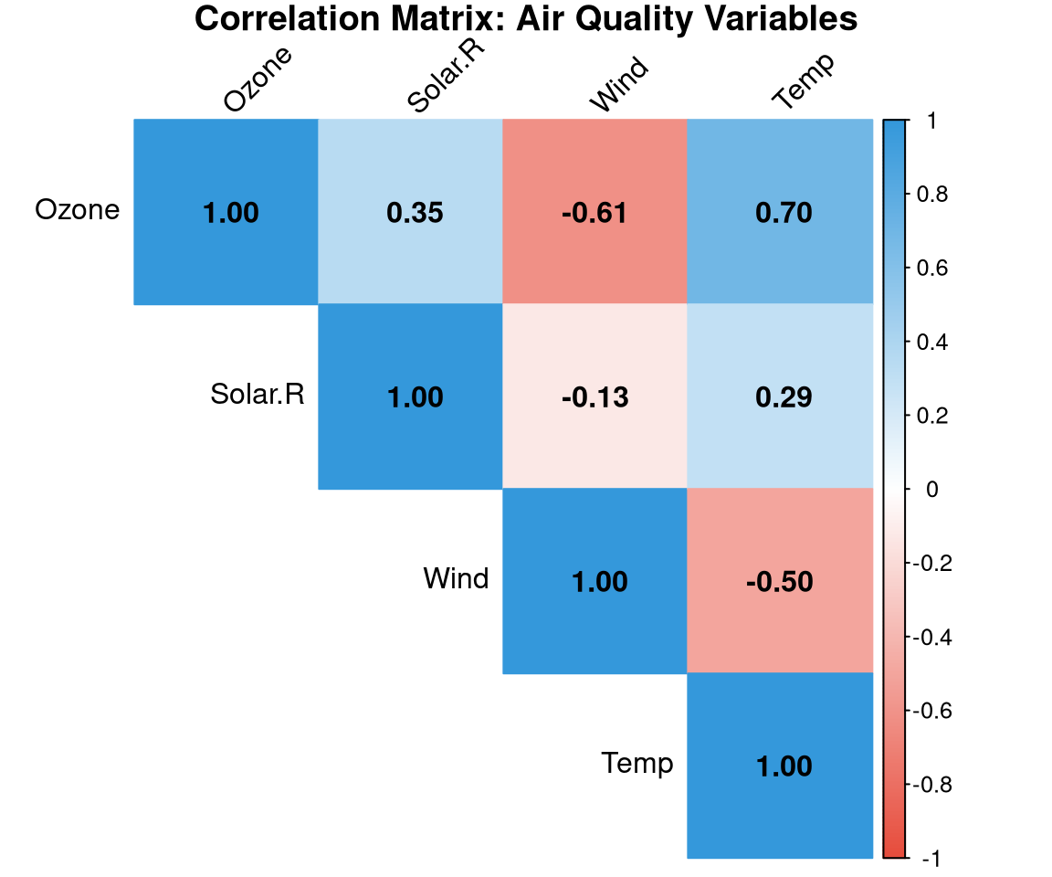
### Visualising Correlations {#sec-cor-viz}
```{r}
#| label: fig-corrplot
#| fig-cap: "Correlation matrix for the airquality dataset. Blue = positive, red = negative."
#| fig-width: 6
#| fig-height: 5
library(corrplot)

corrplot(
  cor_matrix,
  method  = "color",
  type    = "upper",
  addCoef.col = "black",
  tl.col  = "black",
  tl.srt  = 45,
  col     = colorRampPalette(c("#e74c3c", "white", "#3498db"))(200),
  title   = "Correlation Matrix: Air Quality Variables",
  mar     = c(0, 0, 1, 0)
)
```
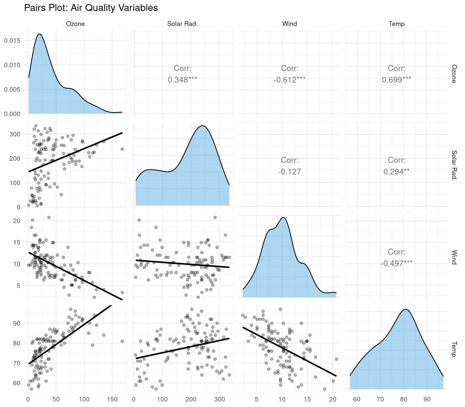
```{r}
#| label: fig-pairs
#| fig-cap: "Pairs plot showing pairwise relationships and distributions."
#| fig-width: 8
#| fig-height: 7
library(GGally)

aq_numeric |>
  ggpairs(
    columnLabels = c("Ozone", "Solar Rad.", "Wind", "Temp"),
    upper = list(continuous = wrap("cor", size = 3.5)),
    lower = list(continuous = wrap("smooth", alpha = 0.3, se = FALSE)),
    diag  = list(continuous = wrap("densityDiag", fill = "#3498db", alpha = 0.4))
  ) +
  theme_minimal(base_size = 10) +
  labs(title = "Pairs Plot: Air Quality Variables")
```
## Identifying Outliers {#sec-outliers}
### The IQR Method {#sec-iqr-method}
An observation is a **potential outlier** if it falls more than 1.5 × IQR below Q1 or above Q3:
```{r}
#| label: outlier-iqr
identify_outliers_iqr <- function(x, na.rm = TRUE) {
q <- quantile(x, c(0.25, 0.75), na.rm = na.rm)
iqr <- IQR(x, na.rm = na.rm)
lower <- q[1] - 1.5 * iqr
upper <- q[2] + 1.5 * iqr
list(
lower_bound = lower,
upper_bound = upper,
n_outliers = sum(x < lower | x > upper, na.rm = na.rm),
outlier_values = x[!is.na(x) & (x < lower | x > upper)]
)
}
identify_outliers_iqr(airquality$Ozone)
```
### Z-Score Method {#sec-zscore}
```{r}
#| label: outlier-zscore
z_scores <- scale(aq_numeric$Ozone)
outlier_idx <- which(abs(z_scores) > 3)
cat("Outliers (|Z| > 3):", aq_numeric$Ozone[outlier_idx], "\n")
```
## A Structured EDA Template {#sec-eda-template}
Here is a reusable EDA template applied to a dataset:
```{r}
#| label: eda-template
eda_report <- function(df, target_var = NULL) {
cat("===== DATASET OVERVIEW =====\n")
cat("Dimensions:", nrow(df), "rows ×", ncol(df), "columns\n")
cat("Missing values per column:\n")
print(colSums(is.na(df)))
cat("\n===== NUMERIC VARIABLES =====\n")
nums <- df |> select(where(is.numeric))
if (ncol(nums) > 0) {
print(skimr::skim(nums))
}
cat("\n===== CATEGORICAL VARIABLES =====\n")
cats <- df |> select(where(is.character) | where(is.factor))
if (ncol(cats) > 0) {
for (col in names(cats)) {
cat("\n", col, ":\n")
print(table(cats[[col]], useNA = "always"))
}
}
}
eda_report(airquality)
```
## Exercises {#sec-ch6-exercises}
1. Using the `diamonds` dataset (from `ggplot2`), compute the mean, median, standard deviation, and IQR of the `price` variable. Is the distribution skewed? How do you know?
2. Compute group-wise summaries of diamond `price` by `cut`. Which cut has the highest mean price? Is that consistent with the highest quality?
3. Create a correlation matrix for the numeric columns of the `diamonds` dataset. Which pair of variables has the strongest positive correlation?
4. Identify outliers in `diamonds$carat` using the IQR method. How many outliers are there? What are their values?
5. **Challenge:** Write a complete EDA report (in Quarto) for India's state-wise crop production data. Include summary statistics, distributions, group comparisons, and a correlation matrix. Use callout boxes to highlight your key findings.