# Data Visualization with ggplot2 {#sec-ggplot2}
```{r}
#| label: setup-ch5
#| include: false
library(tidyverse)
library(scales)
options(scipen = 999)
```
::: {.callout-note}
## Learning Objectives
By the end of this chapter, you will be able to:
- Explain the Grammar of Graphics and how ggplot2 implements it
- Build charts using geometric layers: histograms, scatter plots, box plots, bar charts, and line charts
- Customise scales, colours, labels, and themes
- Create multi-panel plots with `facet_wrap()` and `facet_grid()`
- Control figure output within Quarto documents
- Create interactive charts with `plotly`
:::
## The Grammar of Graphics {#sec-grammar}
**ggplot2** is built on Leland Wilkinson's *Grammar of Graphics* — a principled framework for describing any statistical graphic. Instead of thinking in terms of "chart types", you think in terms of **layers**:
| Component | Description | Function |
|-----------|-------------|----------|
| **Data** | The dataset | `ggplot(data = ...)` |
| **Aesthetics** | Mapping variables to visual properties | `aes(x, y, colour, size, ...)` |
| **Geometries** | The geometric shapes drawn | `geom_point()`, `geom_line()`, ... |
| **Statistics** | Statistical transformations | `stat_smooth()`, `stat_bin()`, ... |
| **Scales** | How data values map to visual values | `scale_x_log10()`, `scale_colour_brewer()`, ... |
| **Coordinate system** | How x/y are laid out | `coord_flip()`, `coord_polar()`, ... |
| **Facets** | Small multiples | `facet_wrap()`, `facet_grid()` |
| **Theme** | Non-data appearance | `theme_minimal()`, `theme(...)` |
: The eight components of the Grammar of Graphics {#tbl-grammar}
## The Basic Template {#sec-template}
Every ggplot2 chart follows the same template:
```r
ggplot(data = <DATA>, mapping = aes(<MAPPINGS>)) +
  <GEOM_FUNCTION>() +
  <SCALE_FUNCTIONS>() +
  <COORD_FUNCTION>() +
  <FACET_FUNCTION>() +
  <THEME_FUNCTION>() +
  labs(title = "...", x = "...", y = "...")
```
Layers are added with `+`. The order matters — later layers are drawn on top of earlier ones.
## Core Geoms {#sec-geoms}
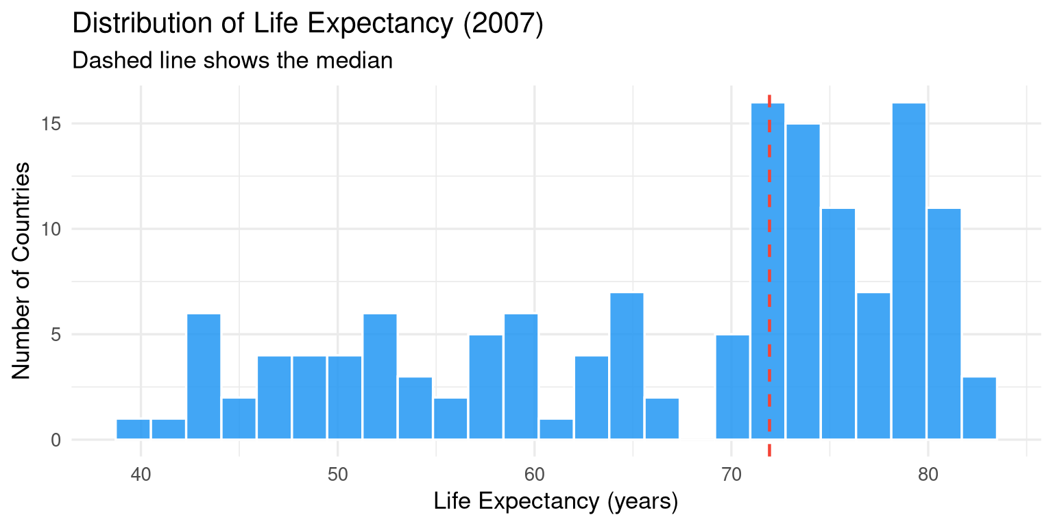
### Histogram (`geom_histogram`) {#sec-histogram}
```{r}
#| label: fig-histogram
#| fig-cap: "Distribution of life expectancy in 2007 across all countries."
#| fig-width: 8
#| fig-height: 4
library(gapminder)

gapminder |>
  filter(year == 2007) |>
  ggplot(aes(x = lifeExp)) +
  geom_histogram(
    bins   = 25,
    fill   = "#2196F3",
    colour = "white",
    alpha  = 0.85
  ) +
  geom_vline(
    xintercept = median(gapminder$lifeExp[gapminder$year == 2007]),
    colour = "#F44336", linewidth = 0.8, linetype = "dashed"
  ) +
  labs(
    title   = "Distribution of Life Expectancy (2007)",
    subtitle = "Dashed line shows the median",
    x       = "Life Expectancy (years)",
    y       = "Number of Countries"
  ) +
  theme_minimal(base_size = 13)
```
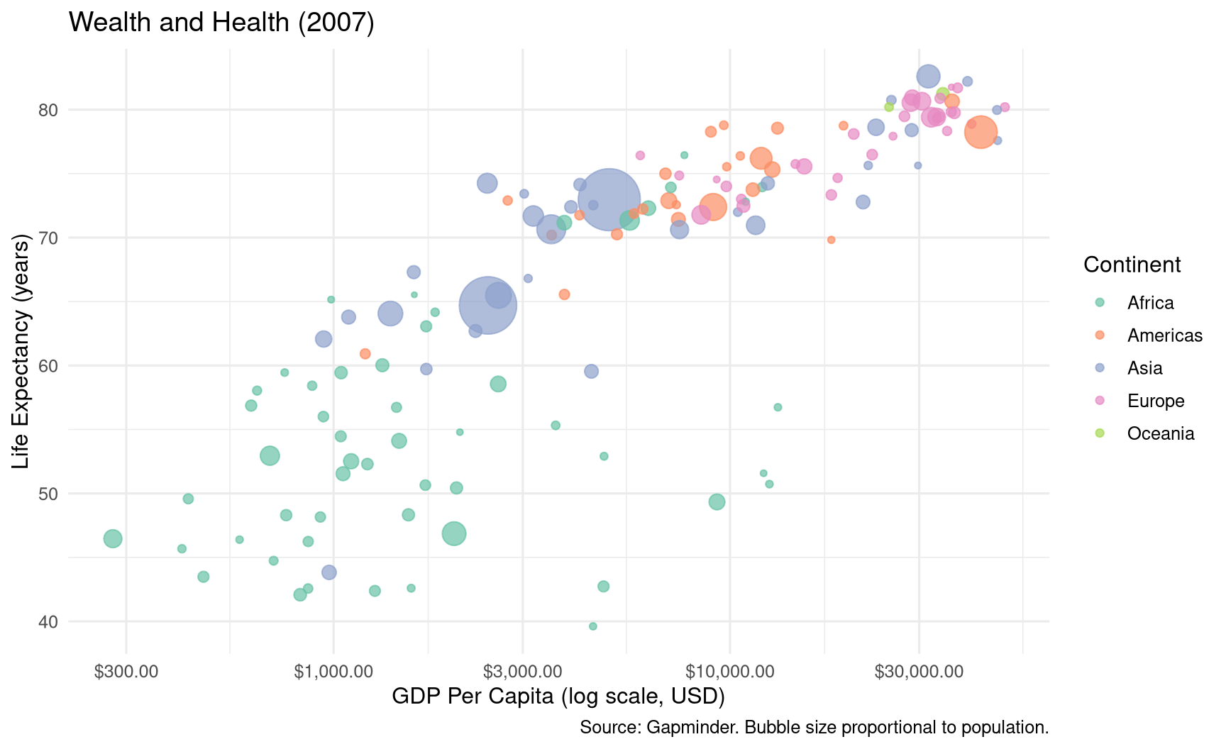
### Scatter Plot (`geom_point`) {#sec-scatter}
```{r}
#| label: fig-scatter
#| fig-cap: "Relationship between GDP per capita (log scale) and life expectancy in 2007."
#| fig-width: 9
#| fig-height: 5.5
gapminder |>
  filter(year == 2007) |>
  ggplot(aes(x = gdpPercap, y = lifeExp, colour = continent, size = pop)) +
  geom_point(alpha = 0.7) +
  scale_x_log10(labels = scales::dollar_format()) +
  scale_size_continuous(range = c(1, 15), guide = "none") +
  scale_colour_brewer(palette = "Set2") +
  labs(
    title   = "Wealth and Health (2007)",
    x       = "GDP Per Capita (log scale, USD)",
    y       = "Life Expectancy (years)",
    colour  = "Continent",
    caption = "Source: Gapminder. Bubble size proportional to population."
  ) +
  theme_minimal(base_size = 12) +
  theme(legend.position = "right")
```
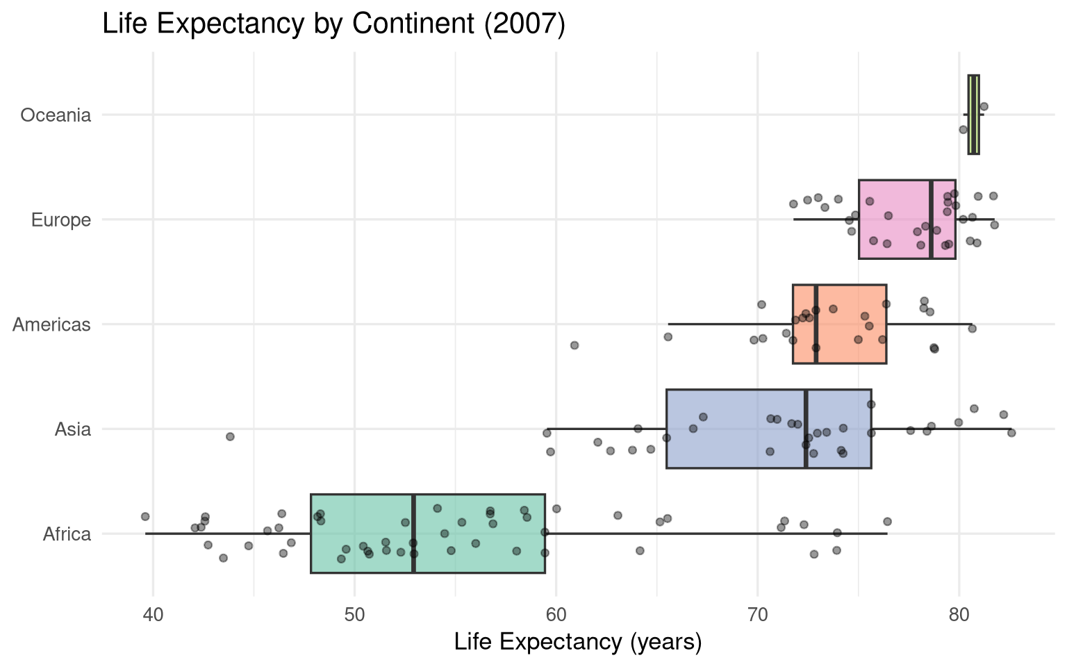
### Box Plot (`geom_boxplot`) {#sec-boxplot}
```{r}
#| label: fig-boxplot
#| fig-cap: "Life expectancy by continent in 2007. Individual country observations overlaid."
#| fig-width: 8
#| fig-height: 5
gapminder |>
  filter(year == 2007) |>
  ggplot(aes(x = reorder(continent, lifeExp, median), y = lifeExp, fill = continent)) +
  geom_boxplot(alpha = 0.6, outlier.shape = NA) +
  geom_jitter(width = 0.25, alpha = 0.4, size = 1.5) +
  scale_fill_brewer(palette = "Set2") +
  coord_flip() +
  labs(
    title = "Life Expectancy by Continent (2007)",
    x     = NULL,
    y     = "Life Expectancy (years)",
    fill  = NULL
  ) +
  theme_minimal(base_size = 13) +
  theme(legend.position = "none")
```
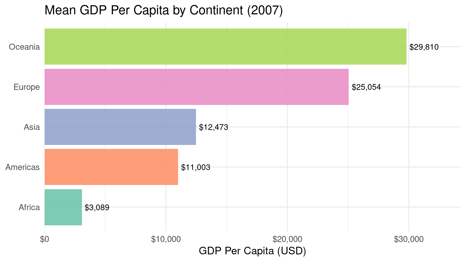
### Bar Chart (`geom_col` / `geom_bar`) {#sec-bar}
```{r}
#| label: fig-bar
#| fig-cap: "Mean GDP per capita by continent in 2007."
#| fig-width: 8
#| fig-height: 4.5
gapminder |>
  filter(year == 2007) |>
  group_by(continent) |>
  summarise(mean_gdp = mean(gdpPercap)) |>
  ggplot(aes(x = reorder(continent, mean_gdp), y = mean_gdp, fill = continent)) +
  geom_col(show.legend = FALSE, alpha = 0.85) +
  geom_text(aes(label = scales::dollar(round(mean_gdp))),
            hjust = -0.1, size = 3.5) +
  scale_y_continuous(
    labels = scales::dollar_format(),
    expand = expansion(mult = c(0, 0.15))
  ) +
  scale_fill_brewer(palette = "Set2") +
  coord_flip() +
  labs(
    title = "Mean GDP Per Capita by Continent (2007)",
    x     = NULL,
    y     = "GDP Per Capita (USD)"
  ) +
  theme_minimal(base_size = 13)
```
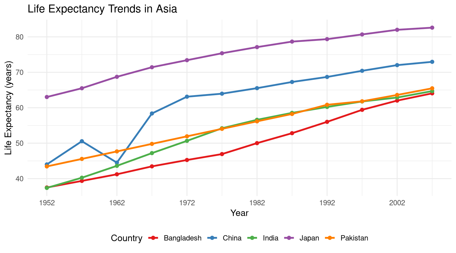
### Line Chart (`geom_line`) {#sec-line}
```{r}
#| label: fig-line
#| fig-cap: "Life expectancy trends over time for selected Asian countries."
#| fig-width: 9
#| fig-height: 5
asian_countries <- c("India", "China", "Japan", "Bangladesh", "Pakistan")

gapminder |>
  filter(country %in% asian_countries) |>
  ggplot(aes(x = year, y = lifeExp, colour = country)) +
  geom_line(linewidth = 1.2) +
  geom_point(size = 2) +
  scale_colour_brewer(palette = "Set1") +
  scale_x_continuous(breaks = seq(1952, 2007, by = 10)) +
  labs(
    title  = "Life Expectancy Trends in Asia",
    x      = "Year",
    y      = "Life Expectancy (years)",
    colour = "Country"
  ) +
  theme_minimal(base_size = 13) +
  theme(legend.position = "bottom")
```
## Customising Plots {#sec-customise}
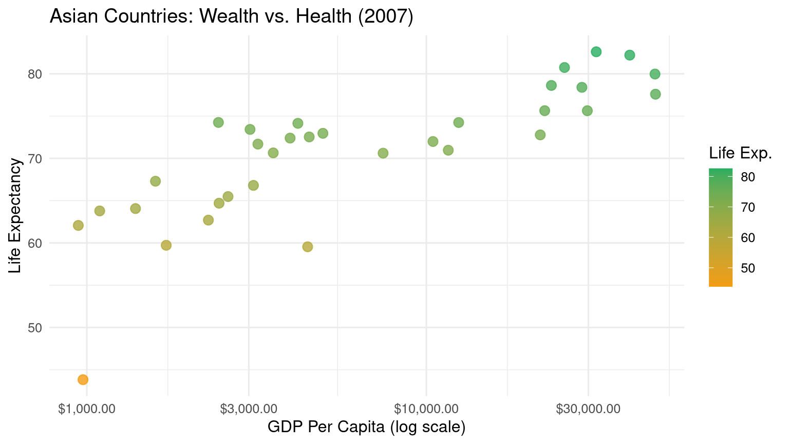
### Scales {#sec-scales}
Scales control how data values map to visual properties:
```{r}
#| label: scales-demo
#| fig-cap: "Demonstration of scale customisation."
#| fig-width: 8
#| fig-height: 4.5
gapminder |>
  filter(year == 2007, continent == "Asia") |>
  ggplot(aes(x = gdpPercap, y = lifeExp, colour = lifeExp)) +
  geom_point(size = 3, alpha = 0.8) +
  # Log scale on x
  scale_x_log10(
    breaks = c(1000, 3000, 10000, 30000),
    labels = scales::dollar_format()
  ) +
  # Colour gradient
  scale_colour_gradient(low = "#f39c12", high = "#27ae60") +
  labs(
    title  = "Asian Countries: Wealth vs. Health (2007)",
    x      = "GDP Per Capita (log scale)",
    y      = "Life Expectancy",
    colour = "Life Exp."
  ) +
  theme_minimal(base_size = 12)
```
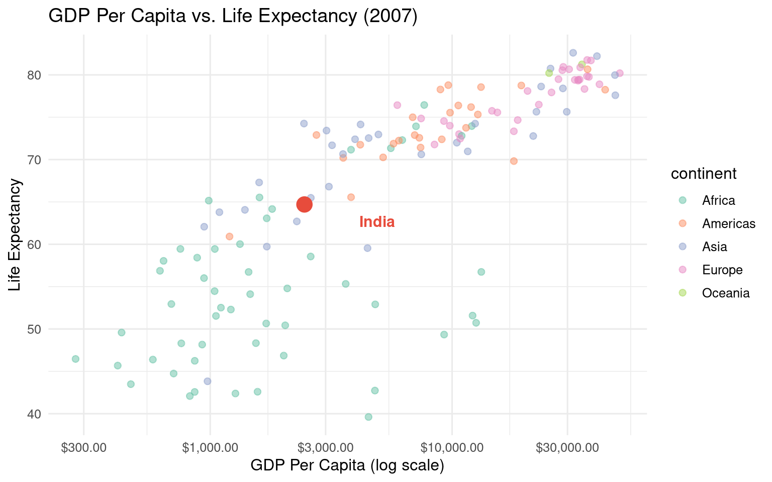
### Labels and Annotations {#sec-labels}
```{r}
#| label: labels-demo
#| fig-cap: "Annotating notable observations on a scatter plot."
#| fig-width: 8
#| fig-height: 5
india_2007 <- gapminder |> filter(country == "India", year == 2007)

gapminder |>
  filter(year == 2007) |>
  ggplot(aes(x = gdpPercap, y = lifeExp)) +
  geom_point(aes(colour = continent), alpha = 0.5, size = 2) +
  # Highlight India
  geom_point(data = india_2007, colour = "#e74c3c", size = 5) +
  # Annotate
  annotate("text",
           x = india_2007$gdpPercap * 2,
           y = india_2007$lifeExp - 2,
           label = "India",
           colour = "#e74c3c",
           size   = 4,
           fontface = "bold") +
  scale_x_log10(labels = scales::dollar_format()) +
  scale_colour_brewer(palette = "Set2") +
  labs(title  = "GDP Per Capita vs. Life Expectancy (2007)",
       x = "GDP Per Capita (log scale)",
       y = "Life Expectancy") +
  theme_minimal(base_size = 12)
```
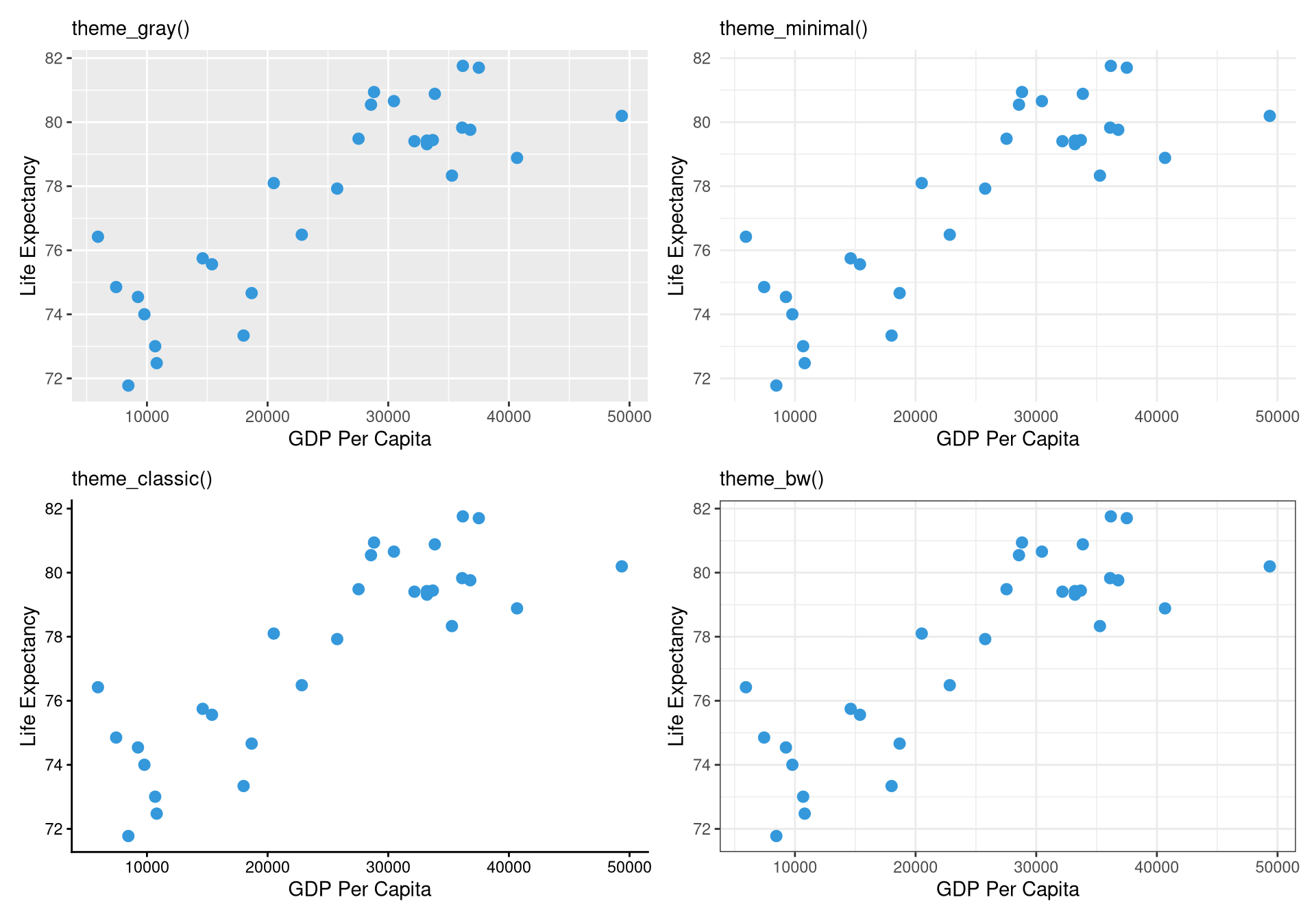
### Themes {#sec-themes}
```{r}
#| label: fig-themes
#| fig-cap: "The same plot with four different themes."
#| fig-width: 10
#| fig-height: 7
base_plot <- gapminder |>
  filter(year == 2007, continent == "Europe") |>
  ggplot(aes(x = gdpPercap, y = lifeExp)) +
  geom_point(colour = "#3498db", size = 2.5) +
  labs(x = "GDP Per Capita", y = "Life Expectancy")

library(patchwork)

(base_plot + theme_gray()    + labs(subtitle = "theme_gray()") +
 base_plot + theme_minimal() + labs(subtitle = "theme_minimal()")) /
(base_plot + theme_classic() + labs(subtitle = "theme_classic()") +
 base_plot + theme_bw()      + labs(subtitle = "theme_bw()"))
```
**Fine-grained theme customisation** using `theme()`:
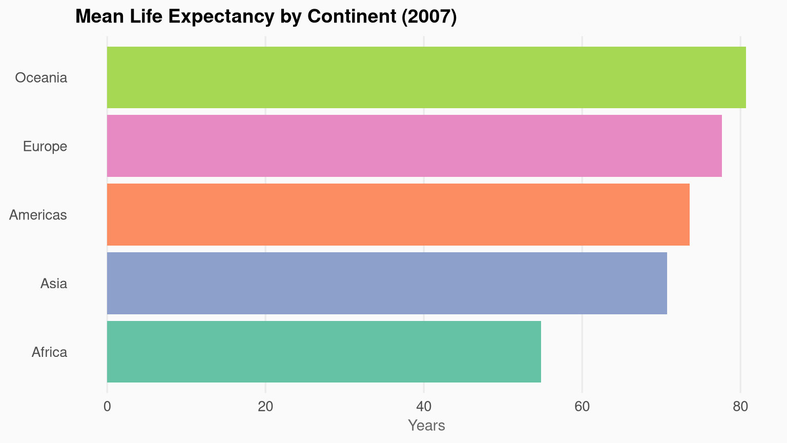
```{r}
#| label: custom-theme-demo
#| fig-cap: "A custom-themed plot with modified fonts, gridlines, and legend position."
#| fig-width: 8
#| fig-height: 4.5
gapminder |>
  filter(year == 2007) |>
  group_by(continent) |>
  summarise(mean_le = mean(lifeExp)) |>
  ggplot(aes(x = reorder(continent, mean_le), y = mean_le, fill = continent)) +
  geom_col(show.legend = FALSE) +
  scale_fill_brewer(palette = "Set2") +
  coord_flip() +
  labs(title = "Mean Life Expectancy by Continent (2007)",
       x = NULL, y = "Years") +
  theme_minimal(base_size = 13) +
  theme(
    plot.title       = element_text(face = "bold", size = 14),
    axis.title.x     = element_text(size = 11, colour = "grey40"),
    panel.grid.major.y = element_blank(),
    panel.grid.minor   = element_blank(),
    plot.background  = element_rect(fill = "#fafafa", colour = NA)
  )
```
## Faceting: Small Multiples {#sec-facets}
Facets split the data into panels by a categorical variable — one of the most effective techniques in data visualisation.
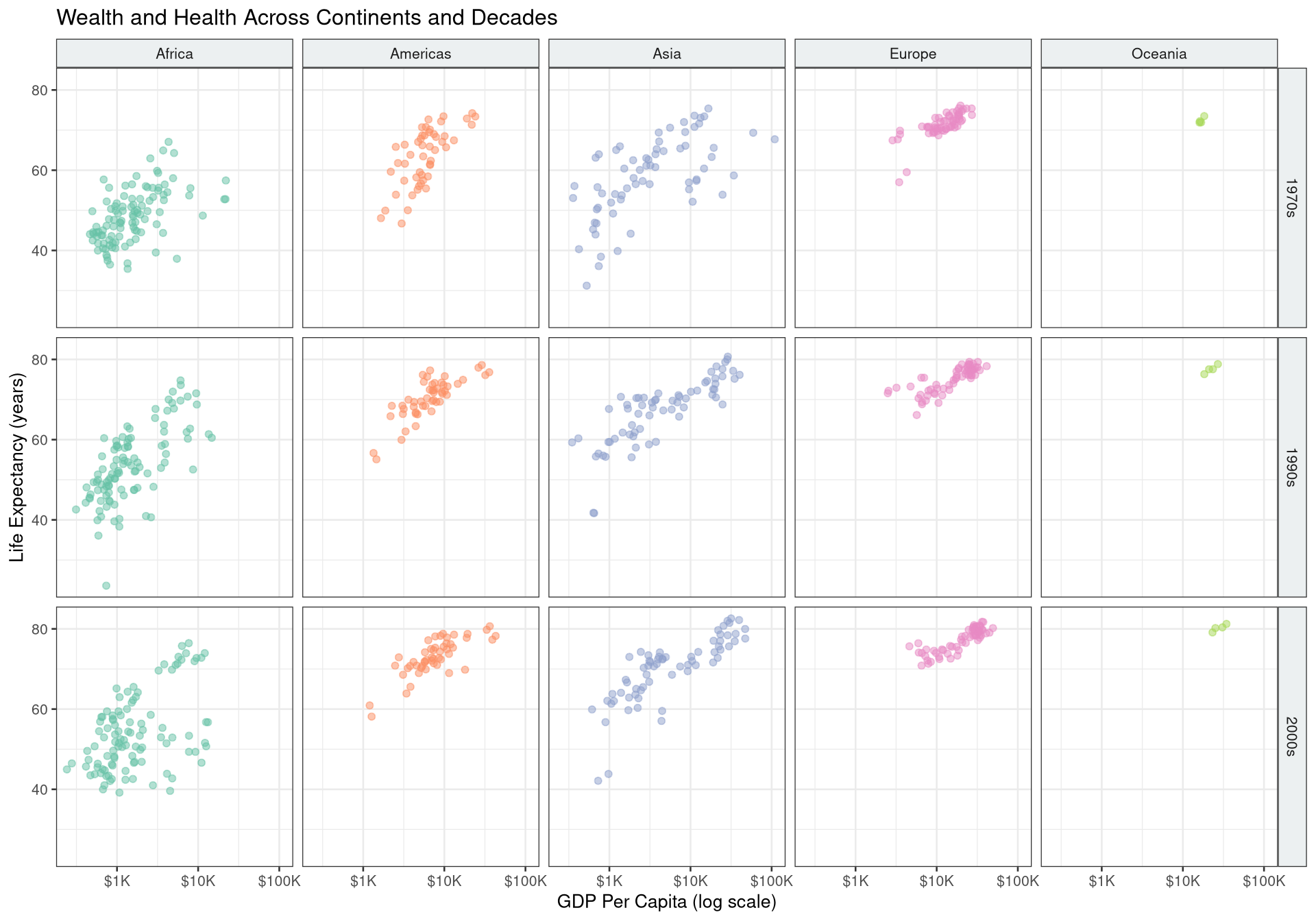
```{r}
#| label: fig-facets
#| fig-cap: "GDP vs. life expectancy faceted by continent and decade."
#| fig-width: 10
#| fig-height: 7
gapminder |>
  mutate(decade = paste0(year %/% 10 * 10, "s")) |>
  filter(decade %in% c("1970s", "1990s", "2000s")) |>
  ggplot(aes(x = gdpPercap, y = lifeExp, colour = continent)) +
  geom_point(alpha = 0.5, size = 1.5) +
  facet_grid(decade ~ continent) +
  scale_x_log10(labels = scales::dollar_format(scale = 1e-3, suffix = "K")) +
  scale_colour_brewer(palette = "Set2", guide = "none") +
  labs(
    title = "Wealth and Health Across Continents and Decades",
    x = "GDP Per Capita (log scale)",
    y = "Life Expectancy (years)"
  ) +
  theme_bw(base_size = 10) +
  theme(strip.background = element_rect(fill = "#ecf0f1"))
```
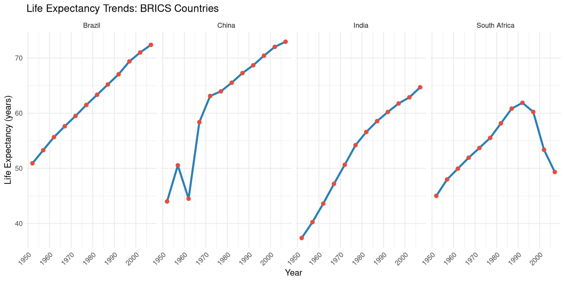
```{r}
#| label: fig-facet-wrap
#| fig-cap: "Life expectancy trends for BRICS countries."
#| fig-width: 10
#| fig-height: 5
brics <- c("Brazil", "Russia", "India", "China", "South Africa")

gapminder |>
  filter(country %in% brics) |>
  ggplot(aes(x = year, y = lifeExp)) +
  geom_line(colour = "#2980b9", linewidth = 1.2) +
  geom_point(colour = "#e74c3c", size = 2) +
  facet_wrap(~ country, nrow = 1) +
  labs(
    title = "Life Expectancy Trends: BRICS Countries",
    x = "Year", y = "Life Expectancy (years)"
  ) +
  theme_minimal(base_size = 11) +
  theme(axis.text.x = element_text(angle = 45, hjust = 1))
```
## Controlling Figures in Quarto {#sec-quarto-figs}
Use chunk options to control figure output:
````markdown
```{r}
#| label: fig-my-plot      # Required for cross-references (@fig-my-plot)
#| fig-cap: "Caption text" # Figure caption
#| fig-width: 8            # Width in inches
#| fig-height: 5           # Height in inches
#| fig-dpi: 300            # Resolution (for PDF/PNG output)
#| fig-align: center       # Alignment: left, right, center
#| fig-alt: "Alt text"     # Accessibility description
#| out-width: "80%"        # Output width as percentage
```
````
For consistent figure sizing across a document, set defaults in the YAML:
```yaml
knitr:
  opts_chunk:
    fig.width: 8
    fig.height: 5
    dpi: 300
```
## Saving Plots {#sec-saving}
```{r}
#| eval: false
# Save the last plot
ggsave("output/figures/life_exp_2007.png",
       width  = 10,
       height = 6,
       dpi    = 300,
       bg     = "white")

# Save a named plot
p <- ggplot(mtcars, aes(wt, mpg)) + geom_point()
ggsave("output/figures/mpg_weight.pdf", plot = p, width = 8, height = 5)

# Vector format for publications
ggsave("output/figures/publication_figure.svg", plot = p, width = 8, height = 5)
```
## Interactive Plots with plotly {#sec-plotly}
`plotly` converts ggplot2 charts into interactive HTML widgets with a single function call:
```{r}
#| label: fig-plotly
#| fig-cap: "Interactive scatter plot of GDP vs. life expectancy. Hover for details."
library(plotly)

p <- gapminder |>
  filter(year == 2007) |>
  ggplot(aes(
    x       = gdpPercap,
    y       = lifeExp,
    colour  = continent,
    size    = pop,
    text    = paste0(country, "<br>GDP: $", round(gdpPercap), "<br>LE: ", round(lifeExp, 1))
  )) +
  geom_point(alpha = 0.7) +
  scale_x_log10(labels = scales::dollar_format()) +
  scale_size_continuous(range = c(2, 12), guide = "none") +
  scale_colour_brewer(palette = "Set2") +
  labs(x = "GDP Per Capita (log)", y = "Life Expectancy", colour = "Continent") +
  theme_minimal(base_size = 12)

ggplotly(p, tooltip = "text")
```
## Combining Plots with `patchwork` {#sec-patchwork}
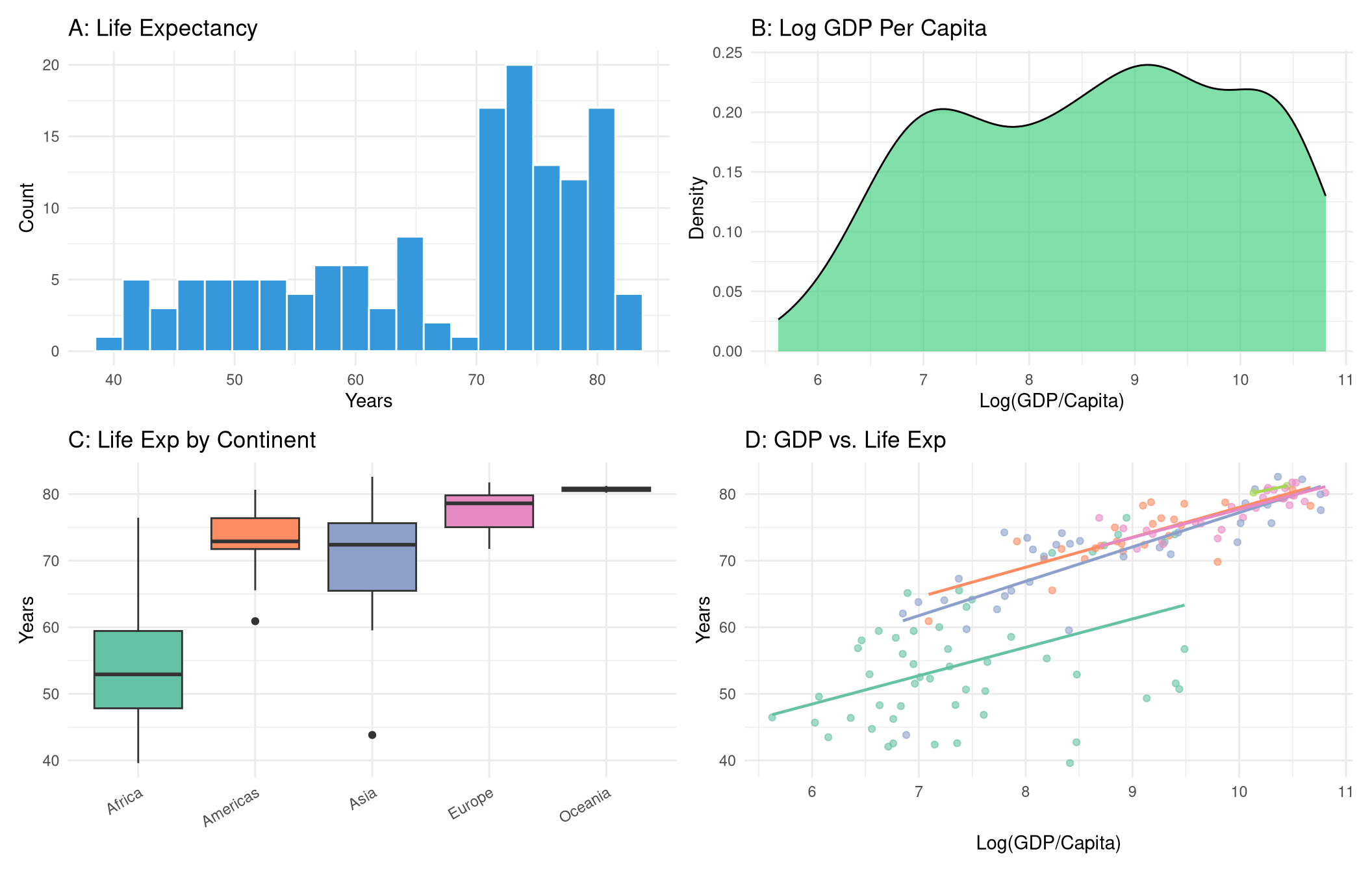
```{r}
#| label: fig-patchwork
#| fig-cap: "Four plots combined with patchwork layout operators."
#| fig-width: 11
#| fig-height: 7
library(patchwork)

gap_2007 <- gapminder |> filter(year == 2007)

p1 <- ggplot(gap_2007, aes(x = lifeExp)) +
  geom_histogram(fill = "#3498db", bins = 20, colour = "white") +
  labs(title = "A: Life Expectancy", x = "Years", y = "Count") +
  theme_minimal()

p2 <- ggplot(gap_2007, aes(x = log(gdpPercap))) +
  geom_density(fill = "#2ecc71", alpha = 0.6) +
  labs(title = "B: Log GDP Per Capita", x = "Log(GDP/Capita)", y = "Density") +
  theme_minimal()

p3 <- ggplot(gap_2007, aes(x = continent, y = lifeExp, fill = continent)) +
  geom_boxplot(show.legend = FALSE) +
  scale_fill_brewer(palette = "Set2") +
  labs(title = "C: Life Exp by Continent", x = NULL, y = "Years") +
  theme_minimal() +
  theme(axis.text.x = element_text(angle = 30, hjust = 1))

p4 <- ggplot(gap_2007, aes(x = log(gdpPercap), y = lifeExp, colour = continent)) +
  geom_point(alpha = 0.6) +
  geom_smooth(method = "lm", se = FALSE, linewidth = 0.8) +
  scale_colour_brewer(palette = "Set2") +
  labs(title = "D: GDP vs. Life Exp", x = "Log(GDP/Capita)", y = "Years") +
  theme_minimal() +
  theme(legend.position = "none")

(p1 | p2) / (p3 | p4)
```
## Exercises {#sec-ch5-exercises}
1. Using `gapminder`, create a scatter plot of `pop` (x) vs `gdpPercap` (y) for the year 1997. Use `scale_y_log10()` and colour by continent. Which continent has the highest GDP per capita among large-population countries?
2. Recreate the line chart from @sec-line but add labels at the end of each line using `geom_text()` instead of a legend. *Hint:* filter to the last data point and use `hjust = -0.1`.
3. Create a `facet_wrap()` plot showing the distribution of `lifeExp` (as a histogram) for each continent in 2007.
4. Build a bar chart showing the top 10 most populous countries in 2007. Arrange bars from most to least populous. Colour bars by continent.
5. **Challenge:** Create a "small multiples" chart showing how the GDP vs. life expectancy relationship has changed across five decades (1952, 1967, 1982, 1997, 2007) using `facet_wrap()`. Make it a polished, publication-quality graphic.